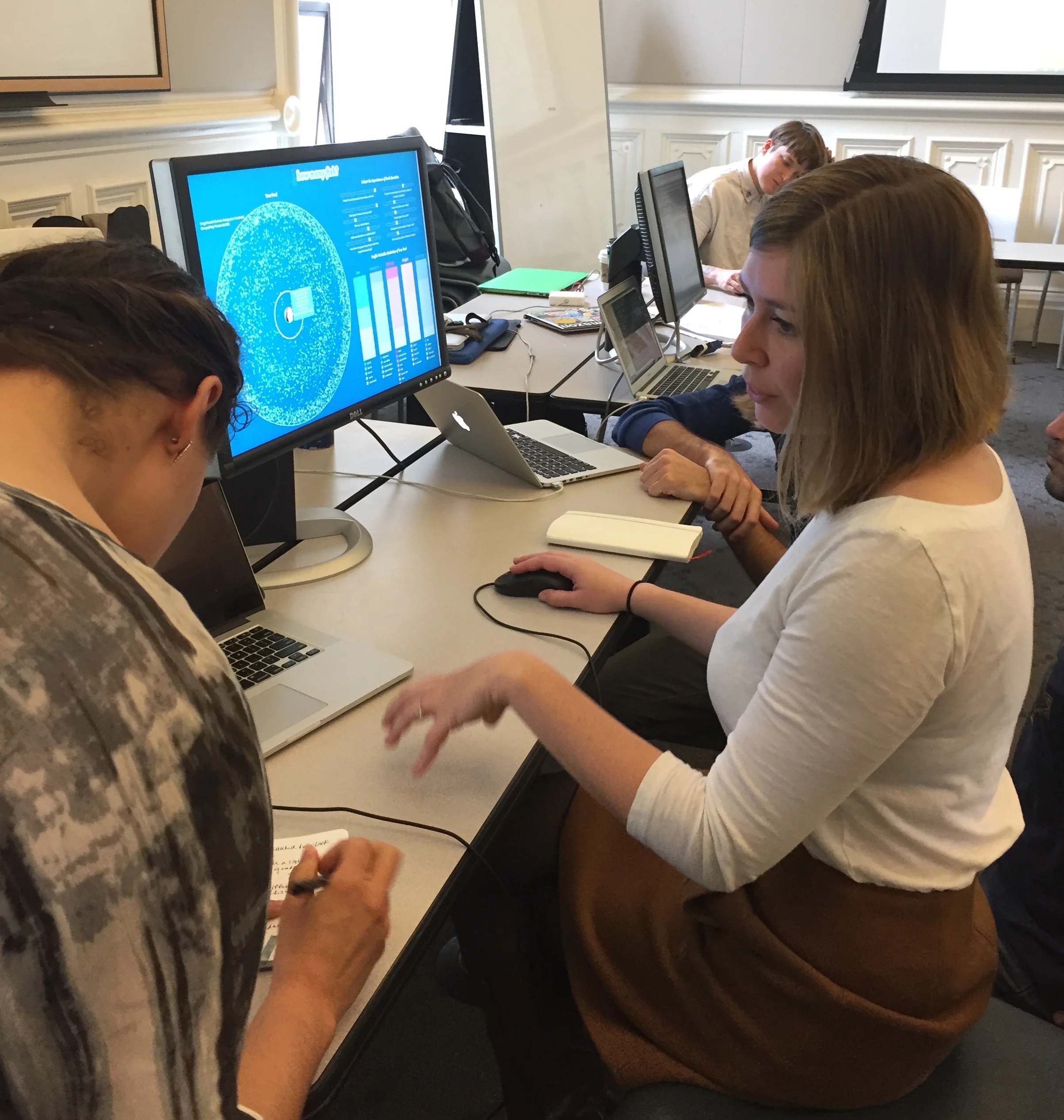
Interaction Visualization Prototype
Early design session based on data from generative user interviews
The Stanford Dissertation Browser project was one of our design inspirations. http://nlp.stanford.edu/projects/dissertations/
This visualization by Jack Hagley provided another design inspiration for us. http://www.jackhagley.com/The-World-as-100-People
How many fish?
A visualization of OKCupid's matching algorithm for INFO 247 - Info Viz
http://howmanyfish.herokuapp.com/
Insights | Users do not have a clear understanding of how OKCupid's matching algorithm works or how their pool of matches actually changes in regard to ethnicity, education level, or body type based on their answers to OKCupid's questions. This algorithmic work happens behind the scenes, giving users few opportunities to challenges their own assumptions and implicit biases.
Role | Research & Design Lead
Problem | How might we encourage consideration of preferences in dating, provide a gentle “nudge” against prejudice in current dating practices, and bring more transparency to algorithms used creating meaningful human connections?
Process | For our generative phase, we conducted semi-structured interviews, mostly over video chat, with 10 current or former users of OKCupid. Interviews ranged from 15 to 30 minutes long and covered topics including answering questions on OKCupid, awareness of how the matching process works, what is most important in a potential match and a dating site, perceptions of prejudice in dating, and general impressions of the concept of visualizing the dating pool.
Based on this data, we set out to design a prototype of an interactive visualization that could help users understand the way OKCupid's algorithm works and the impact of their question answers and question prioritization on their OKCupid match pool, as well as explore the ways in which these choices narrowed or expanded their pool with regard to ethnicity, education level, and body type.
We then conducted usability testing, heuristic evaluation, and an algorithm transparency evaluation survey to evaluate ease of use, effectiveness in conveying information and causing user to pause and reflect on assumptions, and increasing understanding of how the algorithm works.
You can read our final project report here.
Methods | Interviews, Prototyping, Heuristic Evaluation, Usability Testing
Wireframe
Building the sliders
Building the visualization
Usability Testing
Algorithm Transparency Evaluation
Algorithm Transparency Evaluation


